
Tips for Choosing Calm Colors for Your Home
Creating a calm and serene environment in your home starts with the colors you choose for your walls, furniture, and accessories. Colors have the power to influence mood and atmosphere, so selecting the right palette can help you build a peaceful space that promotes relaxation. If you’re looking to refresh your home with gentle, soothing colors, this guide offers practical tips to help you choose calm colors that feel just right.
Why Choose Calm Colors?
Calm colors are those shades that evoke tranquility and comfort, often soft and muted rather than bold and bright. These colors can help reduce stress, improve focus, and make your home feel more welcoming. Whether you want a cozy bedroom retreat or a relaxing living room, calm colors can set the perfect tone.
Popular Calm Color Families
Before diving into tips, it’s useful to know which colors are generally considered calming:
– Blues: Soft blues resemble the sky and water, inspiring a sense of peace.
– Greens: Gentle greens evoke nature and balance.
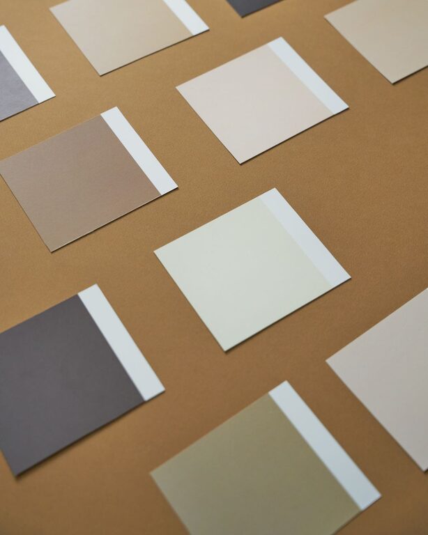
– Neutrals: Warm beiges, soft grays, and creamy whites provide a subtle, calming backdrop.
– Lavenders and Soft Purples: These can add a touch of calm sophistication.
– Pale Pinks: Light pinks bring warmth and softness without overwhelming.
Tips for Choosing Calm Colors
1. Consider the Room’s Purpose
Think about how you use each space. Bedrooms and bathrooms benefit from cooler, soothing shades like light blues and greens, which encourage relaxation. Living rooms may work well with warm neutrals combined with soft accents to create a cozy yet calm vibe.
2. Test Colors in Natural Light
Colors look different depending on lighting. Always sample paint swatches on your walls and observe them at various times of day—from morning light to evening shadows. Natural light usually brings out true tones, while artificial light can change how colors appear.
3. Use Color Psychology Wisely
Understanding basic color psychology helps in choosing colors that promote calmness:
– Blue: Often linked to calmness and reliability.
– Green: Associated with nature and balance.
– Gray: Neutral and sophisticated, but avoid shades that are too dark or cold.
– Beige and Cream: Warm neutrals that feel inviting and comfortable.
Avoid colors that might be too stimulating for relaxation, like bright reds or intense yellows.
4. Opt for Muted and Soft Shades
High saturation colors can be energizing, so instead, pick muted versions that have gray or white mixed in. These softer shades create a gentle atmosphere without being dull. For example, a dusty blue or sage green is more calming than bright royal blue or neon green.
5. Create a Balanced Color Palette
Combine your main calm color with complementary shades to add depth and interest without overwhelming the senses. For instance, pair a soft green with light beige or a pale lavender with warm white trim. Using a mix of textures and finishes can also enhance a calm color scheme.
6. Include Natural Elements
Colors inspired by nature tend to have a calming effect. Consider incorporating earth tones and natural textures like wood, stone, or linen to complement your color choices. These elements create harmony between your decor and the colors on your walls.
7. Use Accent Colors Sparingly
If you love brighter colors, use them as accents rather than main colors. Small pops of color in pillows, artwork, or rugs can add personality without disrupting the calm atmosphere.
8. Think About Durability and Maintenance
Lighter, calm colors can sometimes show dirt or wear more easily. Consider finishes that are easy to clean, especially in high-traffic areas, and balance your color choices accordingly.
How to Apply Calm Colors in Different Spaces
Living Room
Choose warm neutrals or soft pastel blues and greens to create an inviting environment. Use layered textiles like cushions and throws to add comfort in matching calming tones.
Bedroom
Focus on soft, cool colors such as pale blue or lavender to encourage restful sleep. Pair with bedding in similar hues for a cohesive, soothing space.
Kitchen
While kitchens often feature bright or bold colors, calm shades like gentle greens or warm grays can create a fresh, peaceful feel without sacrificing style.
Bathroom
Light blues and seafoam greens work beautifully here, evoking water and cleanliness, which enhances relaxation.
Final Thoughts
Selecting calm colors for your home is a wonderful way to foster peace and comfort in your everyday life. By considering room function, lighting, color psychology, and how colors interact, you can create spaces that feel restful and inviting. Remember that subtlety is key—choose muted tones and natural hues, and use vibrant colors sparingly. With a thoughtful approach, your home can become a sanctuary full of calm and harmony.
—
We hope these tips help you find the perfect calm colors for your home! Happy decorating!
